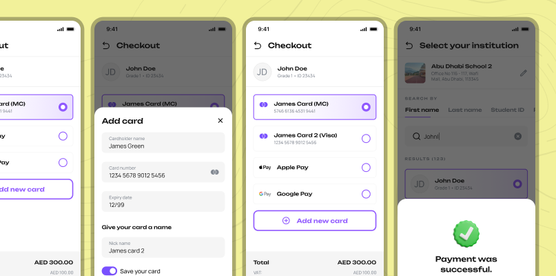
Special consideration
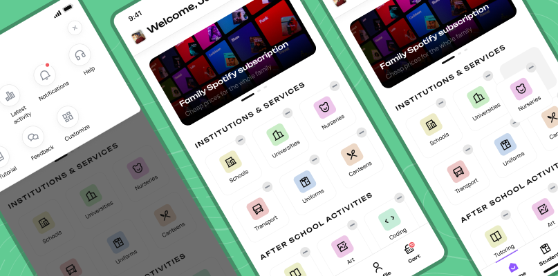
Arabic interface — Right-to-Left as a UX problem
Arabic is read right-to-left — which means the entire spatial logic of the interface flips. Navigation, swipe directions, icon placement, reading order, and visual hierarchy all needed to be reconsidered, not just translated. A component that guides the eye left-to-right in English actively confuses an Arabic speaker.
We designed both versions in parallel rather than retrofitting. Every flow was validated separately with Arabic-speaking respondents from the UAE. Within the first month post-launch, 35% of active users were using the Arabic interface — confirming it as a first-class experience, not an afterthought.