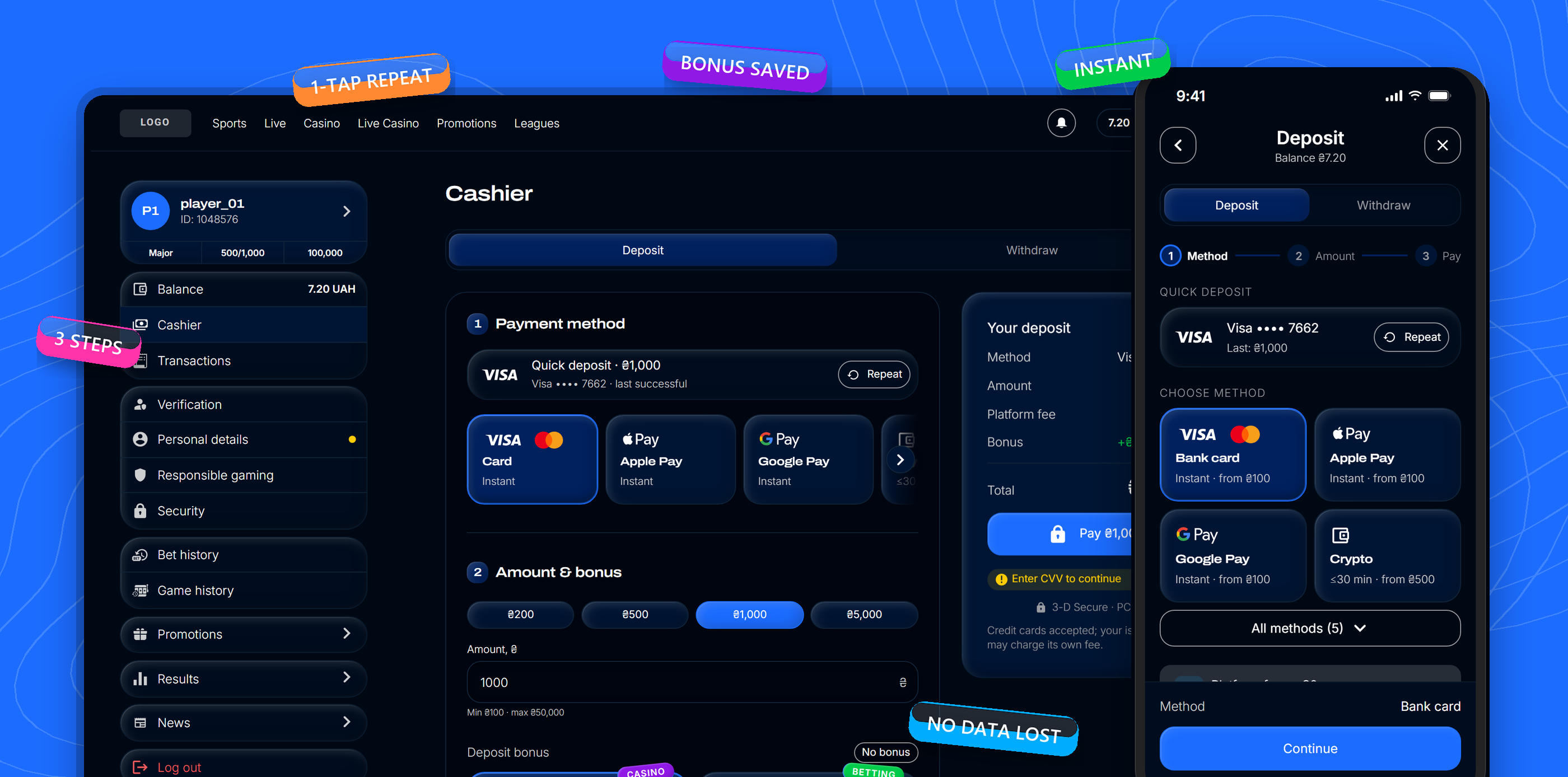
Audited the deposit flow of a sportsbook & casino platform and rebuilt it end to end — 18 UX issues turned into one three-step cashbox with a one-click repeat deposit and a way back after a failed payment.
A failed payment shouldn't cost the player their card details, their bonus or their way back to the game.
01 — Context
Overview & goals
Overview
The cashbox is where money enters the product — and where players drop off. A UX audit of the deposit and withdrawal flow surfaced 18 problems: no sense of progress, the pay button below the fold, a green toast on a failed payment, and errors that threw players back to their profile.
The goal
Get players from “Deposit” to a successful payment in as few decisions as possible — and keep them in the flow when something goes wrong, instead of losing them at the first decline.
North star
Cashbox open → successful deposit
Guardrail
Payment support tickets
Inputs
The team's UX audit, the payment provider's cashbox capabilities (repeat deposit, retry flows, preselected methods, redirects) and the product's design system.
My role
Mapped every audit item to a solution and a cashbox feature, designed desktop and mobile in the design system, and built a clickable prototype with real states and payment scenarios.
02 — Process
What I changed
Five changes that cover all 18 audit items — from the first tap on “Deposit” to the way back into the game.
01 / 05
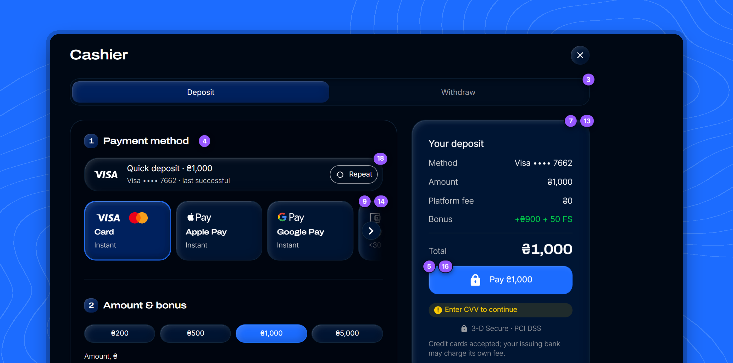
One screen, three steps
Audit #3 · 4 · 5 · 7 · 16Prototype
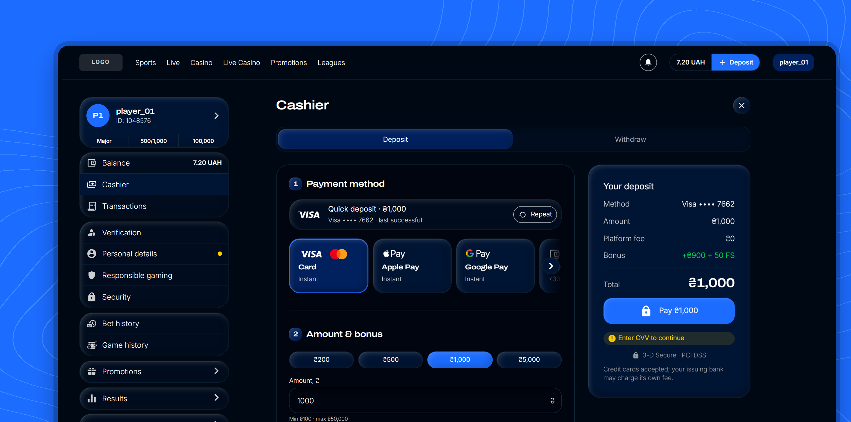
Numbered blocks — method, amount & bonus, card details — on one desktop screen, a stepper on mobile. The summary with the pay button stays in view, and the button always says the amount: “Pay 1 000 ₴”.
Method, amount and card on one screen; the summary never leaves the viewport.02 / 05
Quick deposit & clear methods
Audit #9 · 14 · 18Prototype
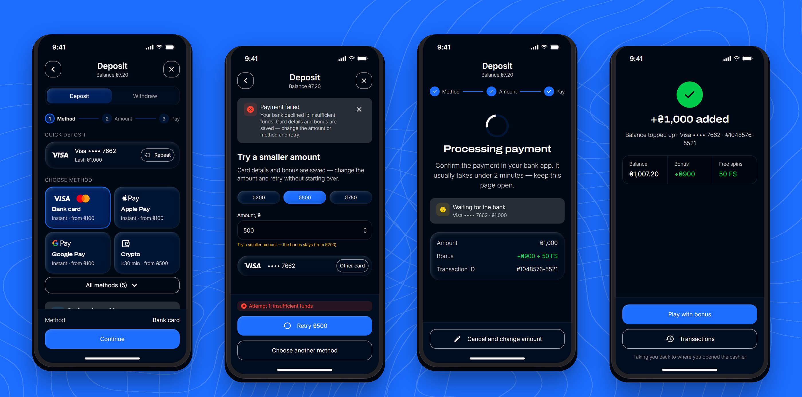
The last successful card sits on top as a one-click “Repeat”. Visa and Mastercard merged into one “Bank card” — the brand comes from the BIN. Every method is the same tile: logo, name, how fast the money arrives.
Mobile flow: quick deposit, retry, processing, success.03 / 05
A way back after a decline
Audit #6 · 11 · 18Prototype
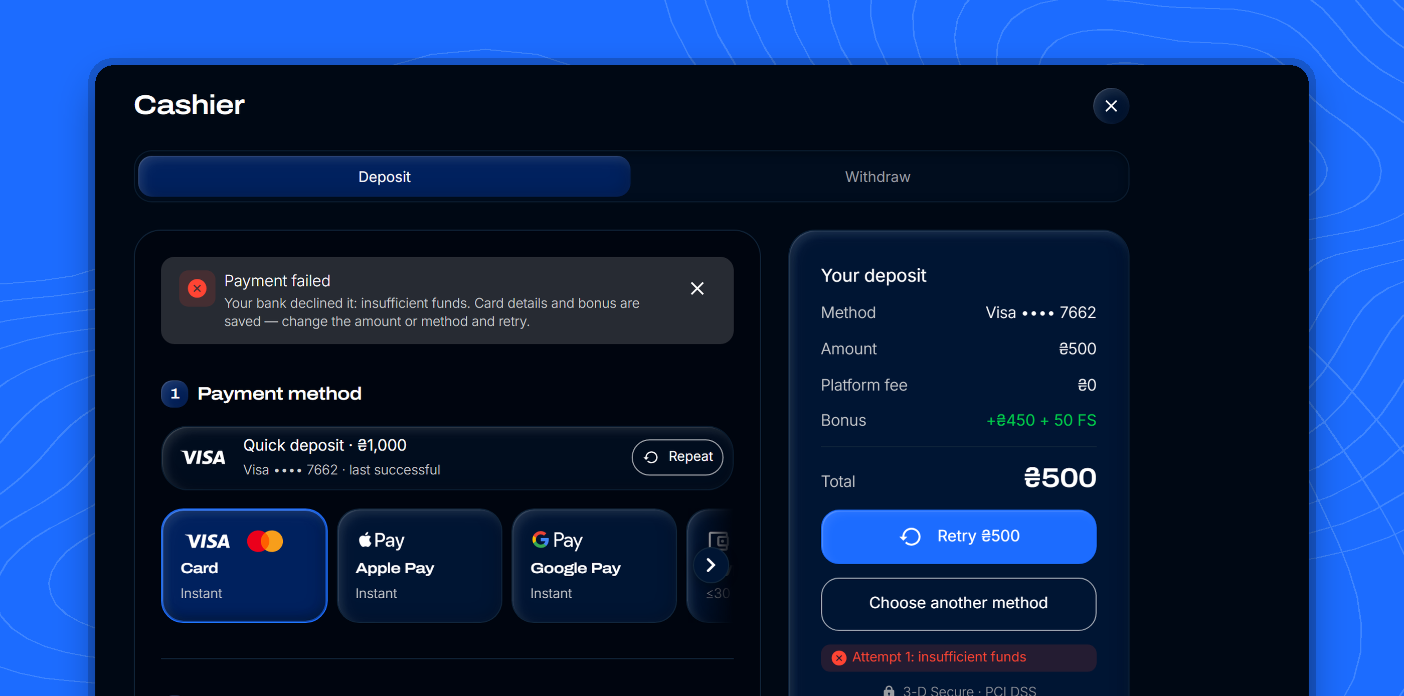
A declined payment used to show a green toast and send players to their profile. Now it's a red message with the reason and the fix, card details and bonus are kept, and the player can retry with a smaller amount or another method in one tap.
Reason, saved data and a “Repeat 500 ₴” instead of starting over.04 / 05
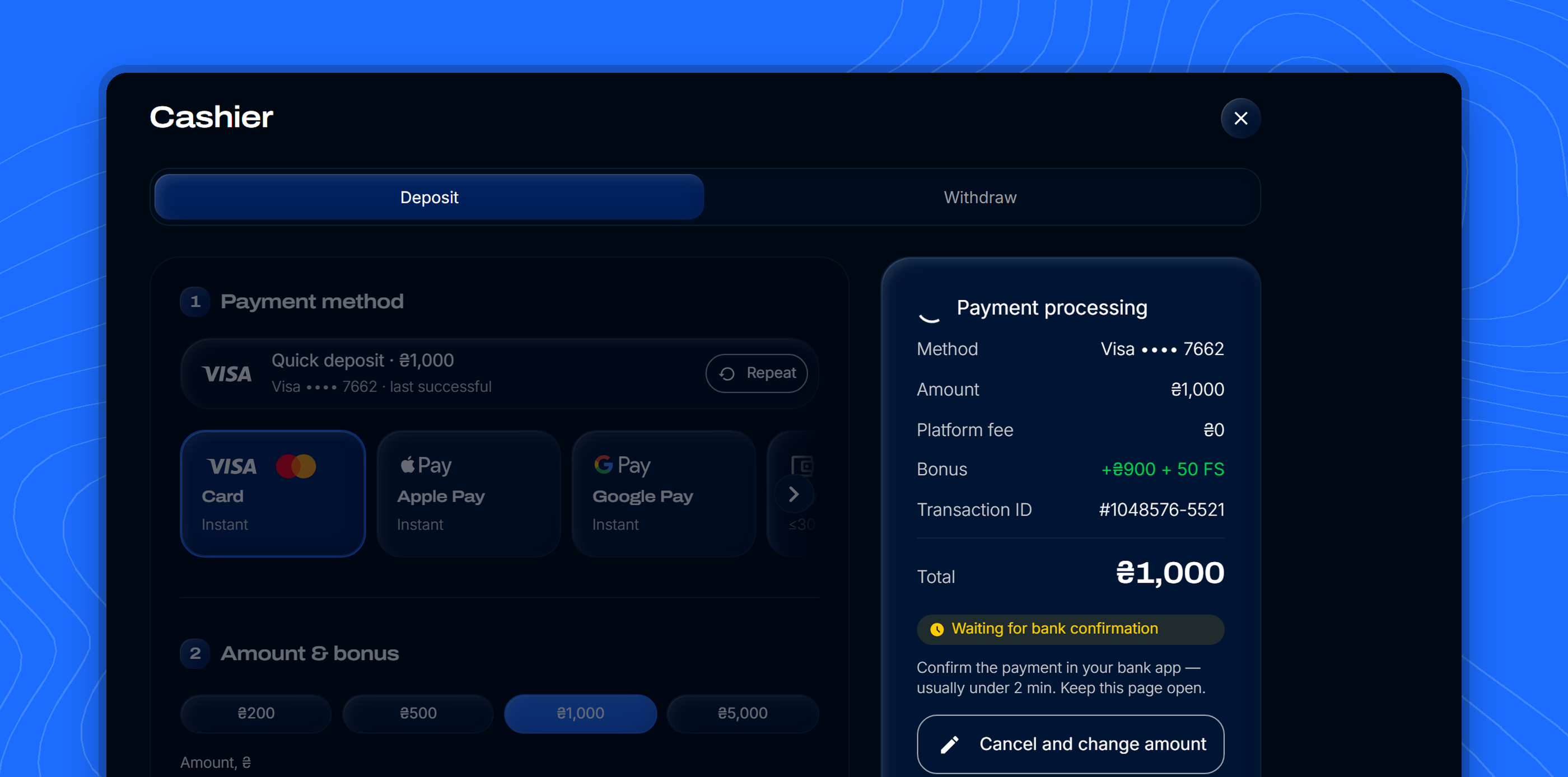
An honest processing state
Audit #10 · 12 · 13Prototype
“Transaction is already being processed” became a clear state: what's happening, how long it usually takes, the operation number and the option to cancel and change the amount. Success returns the player to where they opened the cashbox.
Waiting on the bank, with the amount, bonus and operation number.05 / 05
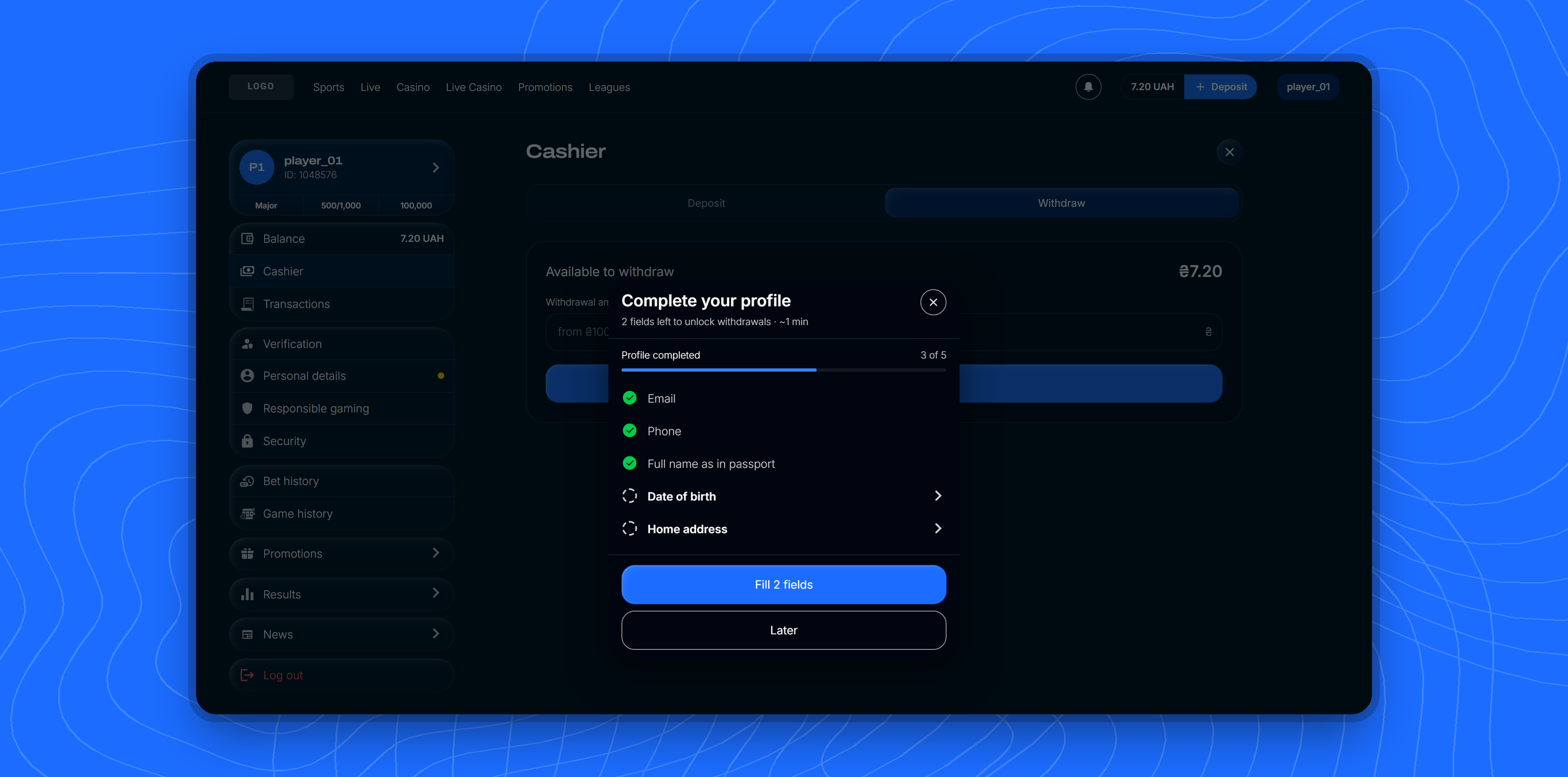
Profile check before withdrawal
Audit #1 · 2Prototype
The empty “fill in your profile” pop-up became a compact checklist: what's done, what's missing, a progress bar and rows that jump straight to the empty field. Only optional fields are marked — everything else is required by default.
“Fill in 2 fields” instead of a wall of empty space.
03 — Traceability
Every audit item, pinned
Each of the 18 problems has a numbered pin in the prototype and a row in the audit table: problem, solution, and the cashbox feature it relies on. Reviewers can jump from any row straight to the screen and state where it's solved.
Numbered pins link each fix back to the audit.
04 — Validation
How we'll measure it
The redesign is ready for an A/B test against the current cashbox. Each change is tied to the metric it should move.
01
Deposit conversion. Cashbox open → successful deposit, and drop-off per step — the three-step layout and the amount in the button.
02
Recovery after a decline. Share of failed payments followed by a successful one within the session — retry with a new amount or method.
03
Time to deposit & repeat rate. For returning players — the one-click quick deposit and preselected method.
04
Payment support tickets. “Where is my money” and duplicate payments — honest error and processing states.
05
Bonus attach rate. Bonus cards tied to the amount instead of a cropped carousel.