 Senior Product Designer
Jul 2026 — Now
Moving design from Figma to code
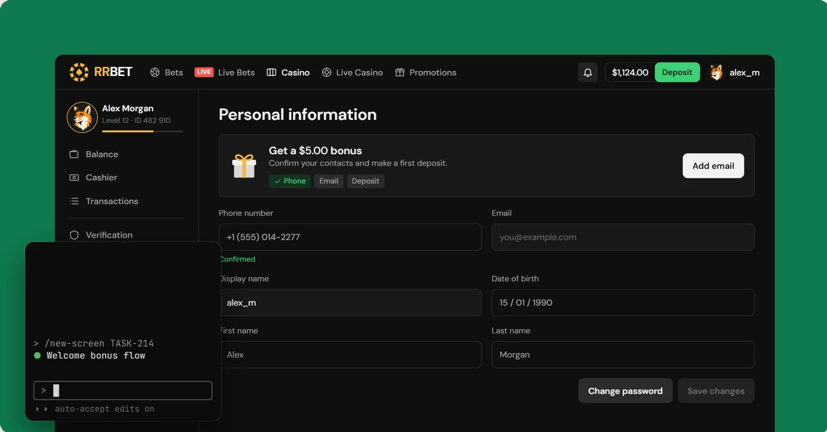
A coded design system, a prototype studio and a Claude Code workflow, built solo in nine days. Designs for a regulated betting product now ship as working prototypes, with every state in them.
Overview
At GGBET, design was handed to developers as static Figma frames. In nine days I built a coded design system, a prototype studio driven by Jira tasks, and an AI-assisted workflow in Claude Code, so a design now ships as a working prototype with every state in it. I’m the only designer next to 4 PMs, 4 frontend and 3 backend developers, and 4 QA.
It was a shift for me too. After 8+ years of showing design decisions as Figma frames, I now test them as working prototypes, on the same stack as the product.
The problem
The Core team owns registration, verification, the player cabinet and the cashbox: a regulated area where the risk sits in states, like a rejected document or a withdrawal that loses part of its amount to tax. Static frames couldn’t carry that. Behaviour lived in comments and developers filled in what was missing, mockups used components the library didn’t have, and stakeholders couldn’t click through a flow or see it on a phone.
Tools are moving too: with AI, a working prototype now costs about as much as a mockup, and a team that stays only in Figma falls behind.
The plan was a 4–6 week migration for a team of ten. Before asking for people and budget, I set out to prove it works alone.
The approach
The workflow
Every task goes from Jira to approval through the same loop. Claude does the first draft and the routine checks. I stay the author: every release in the changelog goes out under my name.
Teaching Claude the patterns
Claude wrote working code, but it didn’t always know which component belongs in which case, and I kept correcting the same choices. So I stopped correcting and wrote the rules down: patterns.md, a file in the repo with every UX and UI pattern for my team. Claude follows it when drafting, /patterns-review checks against it, and every repeated comment becomes a new rule. It’s the part of this work I’d keep if everything else went away.
# patterns.md (excerpt)

## Buttons
- primary: one main action per area
- finance: money only (deposit, withdraw)
- going to another page is a link, not a button
- icon-only buttons always have an aria-label
- several buttons at the bottom of a form: Action group
Make the prototype the spec
Better annotated Figma files were the cheapest option, but behaviour would still live next to the design. Generating code from Figma was fast to demo, but it produces markup, not validation or states.
I chose a coded prototype on the production stack, where states are clickable by default and handoff is a PR with a preview link. That asks designers to work in code, so I drew a clear line first: exploring stays in Figma, and everything that goes to development moves to code.
 Stays in Figma
- Research, CJM and competitor audits
- Moodboards and visual search
- Low and mid-fi sketches, as input
- Illustrations, icons and marketing
- Approved designs, mirrored via /to-figma
 Moves to code
- Feature screens with every state
- Components and variants
- Tokens, changed by PR
- Responsive layouts, 360 to 1440+
- Handoff as a PR with a preview
Building it
The library
Tokens come straight from 300+ audited Figma variables, and components may only use tokens. If a mockup differs from the library, the screen changes. Accessibility at WCAG AA is part of “done”.
The system lives in two versioned packages, one for components and one for tokens: React and styled-components in a pnpm workspace, documented in Storybook, with prototypes on Next.js.
// components only reach tokens through the theme (simplified)
const Root = styled.button`
  height: ${({ theme }) => theme.size.control.lg};
  border-radius: ${({ theme }) => theme.radius.md};
  background: ${({ theme }) => theme.bg.action.primary};
`;

// finance is for money only, one primary action per area
<Button variant="finance" size="lg-40">Withdraw</Button>
<Button variant="tertiary" size="md-32" aria-label="Close" />
It ships like a real package. In 9 days it went through 50+ logged releases, with semver and breaking changes flagged. Many entries are the kind of thing a static frame never surfaces:
- FixModal: the page no longer jumps when its scrollbar disappears. The offset now matches the width actually gained, and the page’s own overflow is restored on close.
- FixToast: the action button left focus behind and stalled the timer, so the toast stayed up after navigating away. Now it runs the action and closes.
- NewPhoneInput: the country code sits in the field and the number follows that country’s mask.
- BreakingFooter: support phones became link rows and a prop was removed, flagged in the log for anyone upgrading.
The prototype studio
A Jira task becomes a clickable flow: steps in the order the player walks, desktop and mobile, real validation and errors. Comments pin to a live state, not to a screenshot.
In daily use
This is now how I ship. I deliver about 7 tasks a month from the live backlog this way, among them a bonus flow, a balance view across web and app, and a clearer breakdown of what the player actually gets on withdrawal. The packages power the prototypes, the studio and Storybook.